A designer who makes complex systems feel obvious.
I'm Robert Van Liew — a product designer who also writes the code and owns the semantic architecture. I specialize in end-to-end experiences for financial products and SaaS platforms — incorporating purposeful motion and transitions to make complex workflows feel seamless. As an ultimate engineering partner, I take designs from low-fidelity flows all the way to production deployment. I actively adopt AI workflows to improve technical efficiency, allowing me to focus relentlessly on interaction craft and accessibility. I approach design with genuine empathy for how people think, decide, and feel when using products — my work is grounded in building tools across finance and consumer experiences that reduce friction and increase confidence
Work, filed under things I'm proud of.
Financial SaaS: Smart Deductions
Sole designer and engineer on Smart Deductions — a local-first expense tracker for LLC owners and 1099 contractors. Drop in any PDF bank statement and get an IRS-ready, auto-categorized CSV export in under 5 seconds. Zero servers. Zero accounts. Complete privacy. Designed and built end-to-end with 9 Schedule C categories, dual chart views, and a command palette.
Jersey Club Radio
Sole designer and engineer on a 24/7 live radio streaming platform for Jersey Club music. From hand sketches and Figma wireframes to a production Beta — persistent mini-player, animated waveform, curated playlist, and a WCAG-accessible dark UI. Three months in development, currently live in Beta.

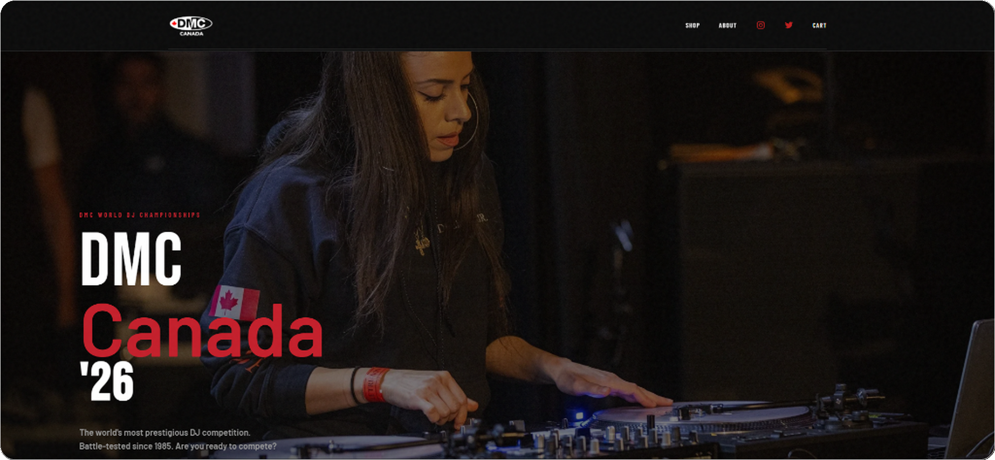
DMC Canada '26
Sole designer and developer for the Canadian division of the DMC World DJ Championships — built and shipped in a 1-week sprint. Designed the full brand system, purposeful micro-interactions, and e-commerce flow, then engineered it to production using React, Next.js, and Stripe.
Systems & Craft.
Demonstrating scalable design tokens and accessible component architecture built for enterprise environments.
Thematic Scalability
Built entirely on CSS root variables, allowing the UI to seamlessly adapt to different product ecosystems without altering the underlying markup. Try swapping the ecosystem theme in the top navigation bar.
Responsive Architecture
Components are engineered to adapt flawlessly across viewports. For example, complex data tables collapse into highly legible mobile cards using robust CSS flex and grid logic, ensuring the Shared Experiences team can deploy once and run anywhere.
WCAG by Design
Every interactive component is audited against WCAG 2.1 AA. Contrast ratios are tested at both default and hover states. Focus rings use :focus-visible with a 3px offset to avoid false positives on mouse users. Motion is wrapped in prefers-reduced-motion — not as an afterthought, but as a first-class token applied globally. These aren't retrofits; they're baked into the design system from the first commit.
Color = Category. Always.
The Schedule C category colors are a design system, not a theme. Each token is referenced exactly once — in the token file — and consumed across the donut chart, bar chart, transaction badge, CSV export column header, and tooltip. "Purple always means Subscriptions" becomes internalized within a single session. This is the color-as-grammar pattern QBO uses across its own reporting surfaces.
Named Easing, Purposeful Duration
Three duration tokens — micro (hover lifts), macro (card transitions), staging (staggered entrances) — share one named easing curve: ease-fluid (cubic-bezier(.22,.68,0,1)). It produces a snappy initial response with a soft settle, avoiding the mechanical feel of ease-in-out. All motion is wrapped in prefers-reduced-motion: reduce at the token level, so no individual component needs to handle it.
Financial SaaS: Smart Deductions
Privacy as the First Impression
The upload screen is the first thing every user sees — before any data, before any insight. Most tools treat the empty state as a loading dock. I treated it as a trust contract. The privacy callout isn't footer copy; it's front and center, inlined with the upload zone, impossible to miss.
I inlined the privacy guarantee directly with the upload action — not buried in a privacy policy, not footnoted below the fold. At the moment of highest user anxiety ("am I about to upload my bank statements?"), the shield icon and the plain-language promise are the first readable text after the headline. For any product handling financial data, trust signals aren't a legal checkbox — they're a conversion mechanism and a brand promise simultaneously.
Cross-Linked Chart Interactions
The donut and bar chart are semantically linked — hovering any segment highlights the corresponding bar, and vice versa. Color tokens are shared across both charts and the transaction table badges — so "purple = Subscriptions" becomes an internalized pattern within a single session. Try it:
Wireframe First, Pixels Later
Before any color or typography, I mapped the core layout spatially. The wireframe phase resolved one critical question: where does "the moment of trust" live? It can't be footer copy. It has to be inlined with the first interaction — which is why the privacy callout ended up inside the upload zone, not below it.
The wireframe placed the privacy callout inside the upload zone — not below it. That decision survived to final. It means every user reads the trust guarantee before they drag a file, not after. The final design only added the shield icon, the exact copy, and the color — the structural decision was made in greyscale.
Frictionless File Ingestion
SMB owners need speed and zero cognitive overhead at entry. The drag-and-drop zone accepts PDF bank statements, CSV exports, and bundled ZIP archives — reducing manual data entry to zero. Multi-file processing means a full year of statements can be uploaded at once and merged into a single unified dashboard.
A key design decision: the processing animation intentionally runs for ~1–2 seconds even on fast files, so the tool feels considered rather than instant. Trust in financial tools is earned through perceived deliberateness — the same principle behind QB's loading states on sensitive operations like payroll processing.
Transparent Processing Feedback
I incorporated purposeful motion into the staggered processing bars. Rather than an instant flash, the deliberate 1.5s animation grounds the user's experience — building psychological trust that their sensitive financial data is being handled with care. Each file's bar animates independently so users can immediately spot if a statement failed to parse.
This visibility is a direct response to the primary SMB anxiety: "Did it get my data right?" By surfacing the extraction count live, users arrive at the dashboard already trusting the numbers — reducing the time they spend auditing results.
What Happens When It Goes Wrong
Most designers stop at the happy path. These are the three failure modes that matter most for a PDF parser — and the design decisions made for each.
Each failure mode gets a distinct signal color (yellow = recoverable, blue = user decision needed, red = unrecoverable) and a single clear action — no stack traces, no generic "something went wrong." The partial extraction warning is the most important: silently dropping 67 transactions would destroy the user's trust in every number on the dashboard. Surfacing it explicitly — with a count — keeps the user in control.
At-a-Glance Financial Summary
Four KPI cards anchor the dashboard. Est. Deductions is the hero card — not Total Spend. For LLC owners, the deductible figure is the one that changes their tax bill. Teal accent color signals this is a positive, opportunity-oriented number. The secondary cards (Total Spend, Transactions, Categories) provide context without competing for hierarchy.
Responsive from Day One
QBO users review expenses primarily on mobile. The layout adapts completely — KPI cards stack vertically, transaction rows expand to full-detail cards, and the export sheet anchors to the top of the viewport to prevent the dropdown-clip that breaks most financial apps on 375px screens.
The "NEEDS REVIEW" row gets a 3px left accent border — a touch-friendly signal that doesn't require a second label to understand. The Export dropdown on mobile anchors to the top of the viewport, preventing the clip that breaks most financial-app dropdowns on 375px screens. The "7 flagged for review" sticky banner is a deliberate QBO reference — QBO uses this pattern for unpaid invoices on its mobile home screen. It functions as a persistent task counter across scroll.
Filterable Transaction Details
Every parsed transaction surfaces with its auto-assigned Schedule C category badge — the same color token as the charts above. Negative amounts (credits, refunds, payments) are automatically separated from charges so users can instantly reconcile statement credits against purchases without manual scanning. Use the filters below to explore:
Clear Action Hierarchy & Platform Pathways
Three export formats serve distinct user needs. Schedule C CSV is the default hero action — IRS-labeled, pre-categorized, directly usable by an accountant or TurboTax upload. Full XLSX serves users who want every transaction for their own records. JSON serves developer/integrations workflows.
The accounting-sync module on the roadmap is intentional: Smart Deductions treats itself as a data preparation layer for larger ecosystems. Users who outgrow single-operator LLC tracking can carry their categorized history directly into their accounting software — a natural upgrade path rather than a dead end.
Global Navigation & Command Palette
The Command Palette (⌘K) is a keyboard-first, cross-surface navigation layer — the definition of a Shared Experience component. Power users can triage any action — upload, filter, export, or configure — without touching the mouse or memorizing a nav tree.
This pattern reduces cognitive load by eliminating deep menu hierarchies. It mirrors how QuickBooks power users navigate between company files, reports, and transaction views — the same mental model applied to a single-page financial tool.
- Fuzzy search across all app actions
- Group headers match the user's mental model (Navigate / Act / Filter / Settings)
- Keyboard navigation (↑↓ + Enter) — zero mouse required
- Accessible:
role="combobox"+aria-activedescendant
The Messy Middle — Design Decisions Under Constraint
I intentionally chose a local-first, zero-server architecture to eliminate GDPR and CCPA compliance risks entirely. No user data ever leaves the device — no consent banner, no data retention policy, no breach liability. This is the most defensible legal posture for a financial tool, and it's the "privacy by design" approach I believe every product handling sensitive data should adopt. Client-side PDF.js trades some OCR accuracy for that guarantee; the UI surfaces confidence signals rather than silently accepting bad extractions.
Cut an ambitious OCR receipt-matching feature for V1 and shipped a rock-solid regex extraction engine instead. When engine confidence is low on a row, the UI flags it for user review rather than silently misfiling it. Shipping a reliable core outweighs experimental edge cases on V1.
An editable rule engine lets users teach the system over time — correcting a misclassified merchant name saves that mapping for all future uploads. This builds a progressively smarter tool without any ML backend, server calls, or data leaving the device.
Color is never the only signal — every category badge has a text label. Chart interactions also have keyboard equivalents. The processing screen uses role="status" live regions so screen readers announce progress. Financial tools must be accessible; a misfiled deduction can have real-money consequences.
I used Claude and Gemini to accelerate the React/Vite boilerplate — scaffolding the PDF.js parsing pipeline, regex extraction engine, and CSV export logic in hours rather than days. This freed me to spend the majority of build time on the high-judgment design work: the confidence-flagging UX, the cross-linked chart interaction model, and the purposeful motion system. Adopting AI tools to improve efficiency is not a shortcut; it's a force multiplier for craft.
Numbers from the Field
Metrics from 4 weeks of personal use + 4 beta testers running real bank statements through the tool. Framed honestly as early instrumentation, not a controlled study — but they reflect real behavior on real financial data.
DMC Canada '26
Fragmented Legacy Platform
The DMC World DJ Championships needed a robust digital overhaul for their Canadian division. The legacy system was fragmented and didn't perform well on mobile devices, leading to cart abandonment during high-traffic ticket drops. The goal was to unify the brand and checkout experience into a single, highly performant web app.
Dark-Themed, Competition-Ready UI
I architected a dark-themed, glassmorphic UI system utilizing stark red contrasts to evoke a sense of competition and energy. Bold typography and full-bleed imagery set the tone for an event that's all about performance and precision.
Friction-Free Purchase Funnel
To solve the conversion issues, I rebuilt the entire e-commerce flow with emphasis on native mobile UX principles. Key touch targets were enlarged, complex forms were broken into step-by-step interactions, and Apple Pay / Google Pay were integrated deeply into the checkout drawer. The result significantly reduced cart abandonment.

Migrating to Stripe for Resilience
To handle high-traffic ticket drops, I migrated the payment infrastructure to Stripe. The payment flow was restructured to preempt errors: inline zip code validation prevents late-stage declines, and explicit error states guide users through card rejections without clearing their cart. By integrating Apple Pay and Google Pay directly into a persistent checkout drawer, the number of required tap interactions was dramatically reduced, directly increasing conversion rates and mitigating cart abandonment.
Sprint Results
Delivered under a hard event deadline. Stakeholder sign-off in a single design review — no revision rounds on visual direction.
Unified Brand + Commerce Platform
The final platform seamlessly integrates ticketing, official merchandise, event information, and competitor registration under a single dark-themed brand system. Every element — from hover states to micro-interactions — was designed to feel cohesive, premium, and razor-sharp for an event built on precision.
Say hello — the tab is open.
Drop a note any time. I usually write back within a day or two — slower when the weather's nice.