A designer who makes complex systems feel obvious.
I'm Robert Van Liew, a product designer who also writes the code and owns the semantic architecture. I specialize in end-to-end experiences for financial products and SaaS platforms, using motion and transitions to make complex workflows feel cohesive. I take designs from low-fidelity flows all the way to production deployment, with a focus on interaction craft and accessibility. My work is grounded in building tools across finance and consumer experiences that reduce friction and increase confidence in how people think, decide, and feel when using products.
Work, filed under things I'm proud of.
Financial SaaS: Smart Deductions
Sole designer and engineer on Smart Deductions, a local-first expense tracker for LLC owners and 1099 contractors. Drop in any PDF bank statement and get an IRS-ready, auto-categorized CSV export in under 5 seconds. Zero servers. Zero accounts. Complete privacy. Designed and built end-to-end with 9 Schedule C categories, dual chart views, and a command palette.
Jersey Club Radio
Sole designer and engineer on a 24/7 live radio streaming platform for Jersey Club music. From hand sketches and Figma wireframes to a production Beta. Persistent mini-player, animated waveform, accessible playlist, and a WCAG-accessible dark UI. Three months in development, currently live in Beta.
Schatz
Julie Schatz Music
Two-week rebuild of a NYC wedding musician site. Started from a placeholder domain with no design, no SEO, and no booking flow. Shipped an editorial visual system, a deep schema build covering LocalBusiness, MusicGroup, Events, Reviews, and FAQ, and a ceremony picker that drafts across pages into the booking form so couples arrive at the inquiry with their music already chosen.

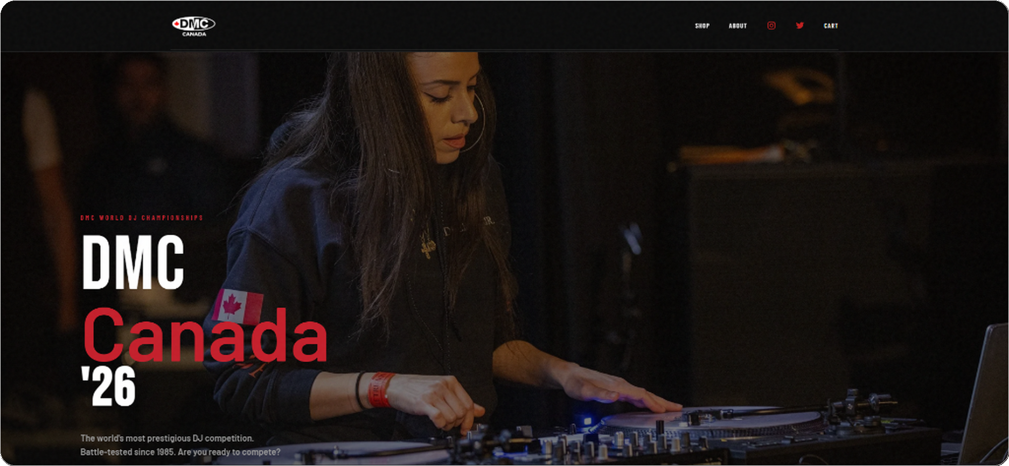
DMC Canada '26
Sole designer and developer for the Canadian division of the DMC World DJ Championships. Built and shipped in a 1-week sprint. Designed the full brand system, purposeful micro-interactions, and e-commerce flow, then engineered it to production using React, Next.js, and Stripe.
Take Me Back Bingo
End-to-end design and engineering for a Hip-Hop and R&B music bingo brand running live nights in NY and NJ. Editorial mixtape identity built around a J-card hero and an SVG-rendered cassette, a free in-browser 5x5 game at /play, full Event and FAQ schema coverage tuned for People Also Ask, and a production share, inquiry, and newsletter system that holds together across announced and dates-pending states via a single feature flag.
Systems & Craft.
Demonstrating scalable design tokens and accessible component architecture built for enterprise environments.
Thematic Scalability
Built entirely on CSS root variables, so the UI adapts to different product ecosystems without altering the underlying markup. Try swapping the ecosystem theme in the top navigation bar.
Responsive Architecture
Components are engineered to adapt flawlessly across viewports. For example, complex data tables collapse into highly legible mobile cards using modern CSS flex and grid logic, ensuring the Shared Experiences team can deploy once and run anywhere.
WCAG by Design
Every interactive component is audited against WCAG 2.1 AA. Contrast ratios are tested at both default and hover states. Focus rings use :focus-visible with a 3px offset to avoid false positives on mouse users. Motion is wrapped in prefers-reduced-motion, not as an afterthought, but as a first-class token applied globally. These aren't retrofits; they're baked into the design system from the first commit.
Discoverable by Design
Search visibility is a design surface, not an afterthought. The Julie Schatz site carries 17 JSON-LD blocks wired together through @id references, so Google reads one connected entity instead of seventeen disconnected ones. LocalBusiness and MusicGroup share an identity. Eight Service entries point back to the business. Fourteen Event entries point to the Person. Ten Reviews drive an AggregateRating computed from real counts, never fabricated. Schema markup is a contract with the search engine, and treating it like a token system means the contract holds at scale.
Color = Category. Always.
The Schedule C category colors are a design system, not a theme. Each token is referenced exactly once, in the token file, and consumed across the donut chart, bar chart, transaction badge, CSV export column header, and tooltip. "Purple always means Subscriptions" becomes internalized within a single session. This is the color-as-grammar pattern QBO uses across its own reporting surfaces.
Named Easing, Purposeful Duration
Three duration tokens: micro (hover lifts), macro (card transitions), staging (staggered entrances), share one named easing curve: ease-fluid (cubic-bezier(.22,.68,0,1)). It produces a snappy initial response with a soft settle, avoiding the mechanical feel of ease-in-out. All motion is wrapped in prefers-reduced-motion: reduce at the token level, so no individual component needs to handle it.
State without a Server
Draft work should follow the user across pages without requiring an account, a sync layer, or a database round-trip. On julieschatzmusic.com a couple builds their ceremony song selections on one page and the draft surfaces inside the booking form on any other page through one namespaced localStorage key. A MutationObserver watches the inquiry drawer for the active state, reads the draft, and renders it inline. A capture-phase submit listener serializes the draft into a hidden field before the form handler reads FormData. The draft only clears on confirmed submission success, so validation errors, network failures, and disposable-email rejections all leave the work intact. The pattern generalizes to any flow where the cost of losing user input is higher than the cost of carrying it.
DMC Canada '26
Fragmented Legacy Platform
The DMC World DJ Championships needed a full digital overhaul for their Canadian division. The legacy system was fragmented and didn't perform well on mobile devices, leading to cart abandonment during high-traffic ticket drops. The goal was to unify the brand and checkout experience into a single, highly performant web app.
Dark-Themed, Competition-Ready UI
I architected a dark-themed, glassmorphic UI system utilizing stark red contrasts to evoke a sense of competition and energy. Bold typography and full-bleed imagery set the tone for an event that's all about performance and precision.
Friction-Free Purchase Funnel
To solve the conversion issues, I rebuilt the entire e-commerce flow with emphasis on native mobile UX principles. Key touch targets were enlarged, complex forms were broken into step-by-step interactions, and Apple Pay / Google Pay were integrated deeply into the checkout drawer. The result significantly reduced cart abandonment.

Migrating to Stripe for Resilience
To handle high-traffic ticket drops, I migrated the payment infrastructure to Stripe. The payment flow was restructured to preempt errors: inline zip code validation prevents late-stage declines, and explicit error states guide users through card rejections without clearing their cart. By integrating Apple Pay and Google Pay directly into a persistent checkout drawer, the number of required tap interactions was dramatically reduced, directly increasing conversion rates and mitigating cart abandonment.
Sprint Results
Delivered under a hard event deadline. Stakeholder sign-off in a single design review. No revision rounds on visual direction.
Unified Brand + Commerce Platform
The final platform integrates ticketing, official merchandise, event information, and competitor registration under a single dark-themed brand system. Every element, from hover states to micro-interactions, was designed to feel cohesive, premium, and razor-sharp for an event built on precision.
Say hello, the tab is open.
Drop a note any time. I usually write back within a day or two, slower when the weather's nice.